Posts

Showing posts from November, 2018

Final Video, Magazine Cover and Double Page Spread

Image
Video CREDITS: thank you to Rebecca Adis Stanley Gordon Gabriel Irvin Neil Thompson Finn Suttcliffe Andrew Nezri Robin Mackillop Maria Bors Beth Ramsden Julian Winchester & my parents without all of whom this project would never have been reality Magazine Cover Magazine Double Page Spread CREDITS: Rebecca Gattely who snapped an uncredited picture on the cover

Film: Draft Cut 3

Image
This is a near final cut of the final film. Since exporting, I have found somethings to change in the audio, which I have done, on a newer draft. The project has become so dense that my computer was pushed to its limits exporting and editing; Premiere didn't allow me to touch any of the frames to scale or move around: that seemed to trigger a warning that crashed Premiere, which I believe is due to how my 8GB of RAM was being maxed out by the project. Thankfully, my computer did not catch fire and did manage to get through the project, and export it. So far, due to this and other technical issues, I am on the 4th alternative copy of the Premiere project. It hasn't been too stressful however, as Premiere has been remarkably reliable. It has also been fun to push my technology to its limits on this project. Safe to say my computer was not designed with prolonged intensive editing in mind.

Editing the Video

Image
In this post I want to touch on a few aspects of the editing. Colour Grading Firstly the colour grading. This is very important to me as it completely sets the mood of the show. I can't have it being bright and colourful, for example. Here are some cropped screenshots of the before and after of the adjustments I did. Aspect Ratio The aspect ratio is the cinematic aspect ratio. I committed a great editing sin when cropping this video in the 2.35:1 (roughly) format. I used two black bars placed on top of the 16:9 video instead of making the video natively 2.35:1. I regret to write that I did this on purpose. It goes right back to when I first created the project. When I made my project and adjusted the sequence settings to 1920x820, Premiere cropped the video but then did not allow me to move the actual clips around within the frame, as it literally cropped the 1920x1080 video pixels into a 1920x820. Meaning if I moved the video down a...

Film: Rough Cut 2

Image
Here is the draft cut with music, and a sort of title sequence as well as much smoother transitions.

Film: Rough Cut 1

Image
This is draft cut of the entire video. There are several cuts to fix here and there, I need to balance the sound and add music.

Magazine Treatment Sheet

Image
Title: Madeleine Target Readership: 18-35 year old millennial female in the ABC1 and also C2 audience. Generally educated and well-aware of current events, perhaps working a steady-paying job, in higher education, or perhaps wants to aim higher with their life goals- has disposable income to buy the fairly priced magazine. Perhaps more grounded than radical, but firmly liberal and progressive, and with carefully considered political views. Quite tech-savvy; knowledgeable user of social media and follower of trends. A woman with stereotype breaking ambitions, and someone who can appreciate the work of other women in breaking traditions and stereotypes. Format: As an established magazine of over 50 years, Madeleine stays relevant by being able to stay classy yet accessible to the greater public. By using an aesthetic reminiscent of mainstream online publications (bright colours, online integration and big, bold sans-serif fonts), blended with more classic aesthetic features (l...

Magazine: Draft 4

Image
Cover Since last time, this cover has undergone significant changes. I'll start from the most obvious. 1. The colour scheme. I've opted to dial down on all the colours that were cluttering the visual balance of the magazine. I've opted to go for a red, black and white theme, which speaks sophistication, but also grabs attention. The sophistication is important given the name of the magazine, and the fact that I include that this is issue 720- this would make Madeleine Magazine about 50 years old. It's a magazine with a reputation and class. The particular shade of bright red is a rather appealing, modern shade. It was inspired by Apple's shade of red on their recent iPhones, which targets the same audience I am making this for. The only text I stray from this scheme is on the "Our New IGTV" title, in which I use the Instagram gradient colour fill. This gradient should be particularly familiar to any millennial- and the subject of Instagram TV...

Magazine: Draft 3

Image
Cover These is a final draft of the magazine cover. There are a few details: - Marie-Claire magazine often feels a tad crowded- so I tried to emulate that even though I'm not a fan of the look. I still kept a fair bit of white space- I didn't want this to be The Sun magazine. - Almost every single cover on Marie-Claire magazine has some sort of reference to sex in it- and even though my magazine has a younger lower threshold of audience age, I found a way to put a reference to a sex symbol in there. Some things I think I need to fix on evaluation of this are: 1. It needs to be clearer that this a women's magazine. I feel like it isn't feminine enough for the name it has- especially compared to Marie-Claire. That doesn't mean I want it to be based on nasty stereotypical representations of women, which shockingly enough Marie-Claire magazine seems to employ sometimes. Too many of their covers have irrelevant references to marital problems or infidelit...

Rough Draft of the Entire Video

Image
This is a first draft of the video. It's more a proof of concept than a draft, as there is a lot more camera work to do.

Magazine: Draft 2

Image
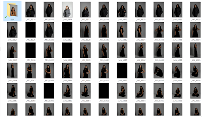
To begin work on the second draft of my magazine, I aim to incorporate some feedback I've gotten on the first draft. Cover 1. For the picture, it is recommended that the subjects looks straight into the camera. This is a convention of women's magazines, and we can see it applied in the Marie-Claire magazine with Jodie Whittaker. 2. There should be only one major title regarding the TV show, as this would be most realistic.  3. If I am choosing the name "Madeleine" it's important to show the heritage of the magazine, as the name makes it clear that the magazine is not a modern publication. Most newer magazines are named abstractly, ex: Vogue, Glamour etc. 4. Space needs to be made for the bar-code and other technical information.  5. Make sure the font subtitles are legible against the background photo. For the magazine cover and inside images I carried out a fashion photo-shoot in a studio. I've tried out a few pictures. These ar...

Rough Drafts of Individual Scenes

Image
Here are a few cuts of the video: This is the draft of the scene in the kitchen, the flashback scene. The audio is very much not final. This is a very simple draft video of the outside scene. It is simply one of the angles the clip will consist of. I particularly like the framing with the 2:1 aspect ratio. This is a short mockup of the entire thing. Every shot in this has been redone, and the cut away shots have been refilmed.

Magazine: Draft 1

Image
My magazine will be in a format very similar to Marie Claire. It will have a short introduction followed by question and answer format relating to the show and the actress My Magazine Taking all this research in, I have to develop a new brand identity for my magazine. Audience is the most important aspect to consider as my TV shows aims to capture a younger audience than that of Marie-Claire. It seems that a clean, mature look is often presented as being anti-millennial. Indeed, even with my analysis of Marie-Claire, I'm guilty of coming to the conclusion that the non-clustered feel, with an elegance means that I did some reading to find out how professionals have decided to cater to the millennial age group in the print format. https://www.fipp.com/news/opinion/can-magazine-brands-advertisers-reach-millennial Millennials are tech-savvy; that much is for sure. Having grown up in an environment heavily emphasising online connectivity, these digital natives are shifting aw...

The Magazine: Initial Research

Image
Magazine Mood-Board I love the picture heavy magazine format. For mine, I initially wanted to focus on a gender neutral lifestyle magazine, so that I could. However, I soon found no such thing exists (or Google didn't know what to show). So I decided to focus just on my female lead actress. This opened up many opportunities. Vogue, Elle, Cosmo, and Marie-Claire were the prime picks. I chose Marie-Claire, and not completely because of my bias towards Doctor Who, with this cover that they had: Marie-Claire is a women's lifestyle magazine that claims to cover the "latest fashion & beauty trends, opinion, celebrity news". This is great, as I'm sure my interviews with the actors would fall into this category. Either way, the article on Jodie Whittaker is exactly what I'd like to do, so it perfectly aligns with my personal goals for the article. The magazine itself costs £4.20, but it is sold on any 2 for £6 deal at Tesco, showing perhaps it...

Filming, Part 3

Image
Today's filming went really well. We started filming around 9:40am in the morning, and we ran till 12:10pm. We had to replace one of the actors though. The person who played Andrew was not available, so I replaced him with another Drama student. This wasn't a problem and did not interfere with anything I had shot previously, as all his scenes were individual. I simply reshot the scenes today. For main encounter scene, I changed the location from the deck to under a tree. This was much better as there was more space to move the camera around and to direct the actors. It was brighter to film in and also probably a more realistic place for someone to have a picnic. I cut down the number of crew this time as well- we only had 3 crew and 2 cast. This allowed each crew member to do more, and also meant it was easier for me to direct them on what to do. They have all consistently helped me in both the prior shoots so they knew what they had to do, which made things very stress-f...