The Magazine: Initial Research
Magazine Mood-Board
I love the picture heavy magazine format. For mine, I initially wanted to focus on a gender neutral lifestyle magazine, so that I could. However, I soon found no such thing exists (or Google didn't know what to show).
So I decided to focus just on my female lead actress. This opened up many opportunities. Vogue, Elle, Cosmo, and Marie-Claire were the prime picks.
I chose Marie-Claire, and not completely because of my bias towards Doctor Who, with this cover that they had:
Marie-Claire is a women's lifestyle magazine that claims to cover the "latest fashion & beauty trends, opinion, celebrity news". This is great, as I'm sure my interviews with the actors would fall into this category. Either way, the article on Jodie Whittaker is exactly what I'd like to do, so it perfectly aligns with my personal goals for the article.
The magazine itself costs £4.20, but it is sold on any 2 for £6 deal at Tesco, showing perhaps it's not as high-end as it presents itself.
I would say that the magazine seems to be targeting women over the age of 25, particularly based on the people they feature, who are generally well established women of the industry, and the fashion they feature- it's generally more expensive and suitable for an audience that has a fair amount of disposable cash. There's also the general look, with the fonts and white space, that exudes class and maturity, sort of timeless in it's appeal and not conventionally what we'd see from magazines targeting a younger crowd.
It's still on the premium end of the scale though, judging by it's cover. It isn't trying too hard to be brimmed to the top with information; the cover has a fair amount of white-space and the titles aren't too loud or overpowering. It's simple and elegant.
I particularly like the use of sans-serif fonts throughout. It gives it a very modern and clean look. They're tastefully contrasted with bold serif fonts that give it prestigious, premium feel.
The magazine uses an almost even balance of pictures and text. This is consistent with the magazine's non-crowded, premium look and feel. The photography is obviously very important, with a lot of focus on fashion, with it being a women's magazine.
The article focuses almost entirely on the TV show and Jodie's relationship with it, particularly playing her character. The article does of course have a feminist leaning, as it only questions in terms of how she can be a role model, or how she breaks or bends stereotypes, which all links with in how Jodie is the first woman to play the long-time male character of the Doctor. It's important to note that this piece is a 4 page spread (taking up 8 pages).
The title of the piece, "The Woman Who Fell To Earth", is the title of the first episode of Doctor Who. That line also sets the topic of the article as being primarily about Doctor Who, but also about the woman. It's a nice way to begin the article I think, it sets audience expectation. The word is also interesting as it is engaging; note how the last word "EARTH" is on the page with Jodie on it, the rest of the sentence serving as direction to the readers eye, slowing guiding them over to the short "blurb" of sorts on the article.
The piece begins with a short expository introduction, setting the scene for the interview, but from thereon, it follows a question and answer format. It really captures the interviewees sense of voice, and the interviewer never says too much; they probe further or introduce something to talk about. The interviewee is always the main focus.
The formatting is very delicate through-out. Whether it's the bright, shining colours in the photos, or the elegant sans-serif fonts, there is a defined "feminine" feel to the magazine that makes it seem very light.
Because of how perfect this Marie-Claire magazine article is, I won't be doing textual analysis or comparison to another magazine. This hits the mark through-out.
More Examples of Covers
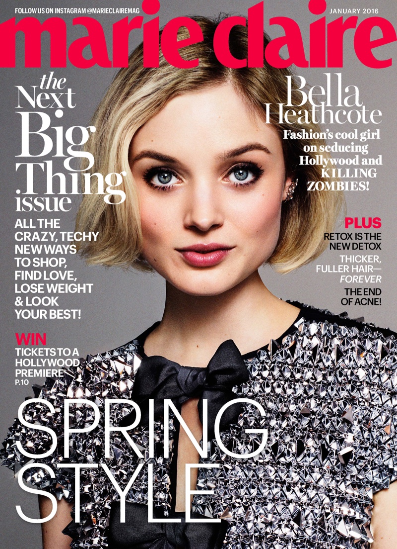
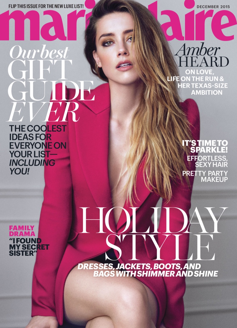
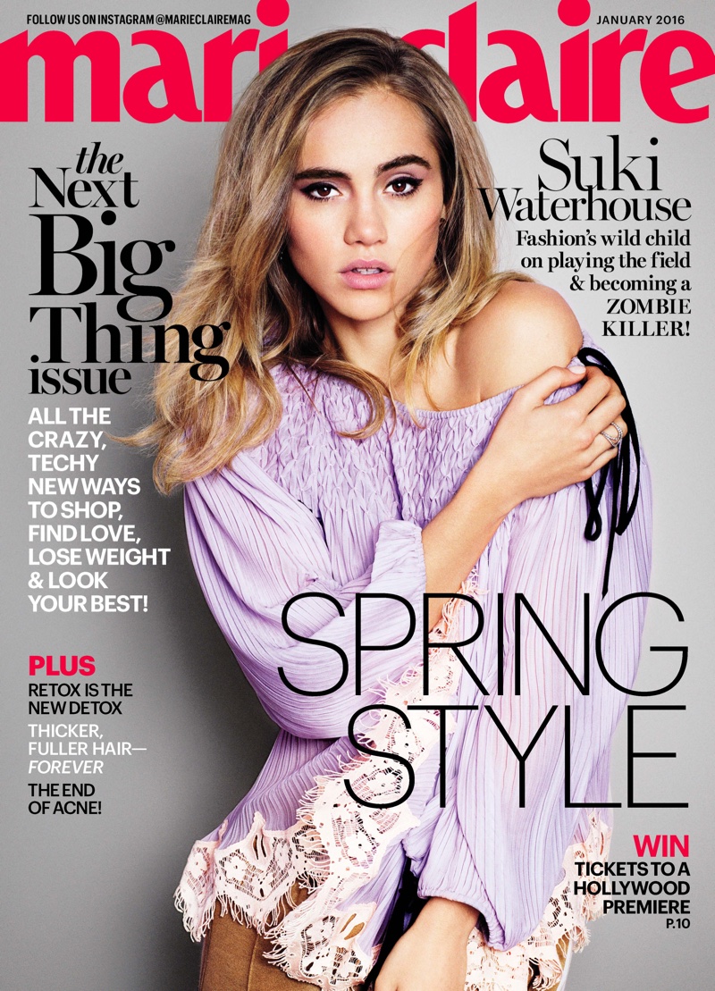
Since one cover is not enough to base an magazine off, I looked at a few more by Marie-Claire for inspiration.


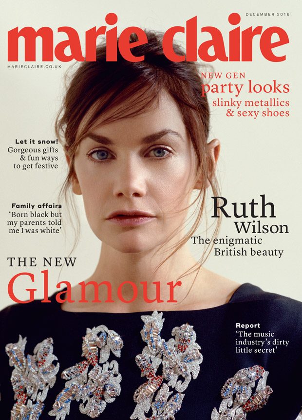
Given that all of these seem to be from the USA, I looked in particular for the British version:


Fonts
Fonts are important to get right if I'm basing mine on Marie-Claire. The masthead is easy, as you can download the PNG file. The content fonts are harder. I did a bit of research and found these things.
I also looked at this article for inspiration on fonts to use. I've downloaded Helvetica & Trajan.
https://www.canva.com/learn/magazine-cover-design/


Comments
Post a Comment