Magazine: Draft 2
To begin work on the second draft of my magazine, I aim to incorporate some feedback I've gotten on the first draft.
Cover
Cover
1. For the picture, it is recommended that the subjects looks straight into the camera. This is a convention of women's magazines, and we can see it applied in the Marie-Claire magazine with Jodie Whittaker.
2. There should be only one major title regarding the TV show, as this would be most realistic.
3. If I am choosing the name "Madeleine" it's important to show the heritage of the magazine, as the name makes it clear that the magazine is not a modern publication. Most newer magazines are named abstractly, ex: Vogue, Glamour etc.
4. Space needs to be made for the bar-code and other technical information.
5. Make sure the font subtitles are legible against the background photo.
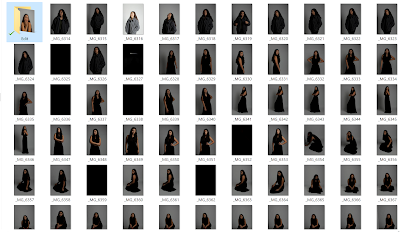
For the magazine cover and inside images I carried out a fashion photo-shoot in a studio.
For the magazine cover and inside images I carried out a fashion photo-shoot in a studio.
I've tried out a few pictures. These are a few I thought were viable cover options, and reminiscent of actual magazine covers.
The editing isn't particularly fine in regards to the overlaying of the face over the masthead, and I've included one without that effect. I do very much love the pictures I took for the cover though- they were directly inspired by a few photoshoots that Jodie Comer had to do for promotion materials on Killing Eve. These are common poses on women's magazines as well.
I decided to make the masthead bigger in the latter two images- it felt like there was too much space. I've removed the second subheading detailing the TV show, and I've made sure to have the subject look directly into the camera. The copy on the page is non-final, I want to be more imaginative with what I'm putting on there. I do quite like the fonts though. I still need to add social media links to it and target the younger audience.
Double Page Spread
I've started learning InDesign from scratch to create the double page spread. This video series by TastyTuts has been a massive help.
Following what I've learnt from this series, I've put together a inDesign document of the pages.
The titles and text are of course, not final. But so far this is the basic gist of it. The blank spaces will be filled with images, as I want the magazine to be image heavy.
Following what I've learnt from this series, I've put together a inDesign document of the pages.
The titles and text are of course, not final. But so far this is the basic gist of it. The blank spaces will be filled with images, as I want the magazine to be image heavy.


Comments
Post a Comment